Have you ever emailed someone your resume, carefully formatted and designed to be an exact two pages, only to have them tell you that the formatting looked all “messed up” on their end, with page breaks in weird places and the content running over to a third page?
Assuming they are opening your resume using the same software it was created with (opening a Microsoft Word .DOCX in Word, for example, not Google Docs), the culprit for the messed-up format is likely the fonts you used in the resume.
Once upon a time, in the early days of word-processed resumes, the best resume font choice was easy. In those days, almost everyone created their resume using Arial or Times New Roman font. After all, anything looked better than the old-fashioned standard font on typewritten resumes.
But, it wasn’t long before resumes created using Arial and Times New Roman fonts began to look old-fashioned too. Of course, everyone was using these resume fonts, and when “everyone” is doing anything on a resume, and you follow suit, your resume inevitably gets that dreaded cookie-cutter look.
By the early 2000s, many resume writers recommended choosing a different font for your resume, and never using Arial or Times New Roman. Cookie-cutter resumes that look just like everyone else’s resume are one of the worst mistakes you can make as a job seeker. So, we agree with this advice. But it also posed a new set of problems.
More than two decades later, we are still grappling with these same questions and problems.
What, then, are the best fonts for your resume? If you ask most recruiters and hiring managers for their opinion on the best resume font, most will tell you that it doesn’t matter. Resume content is the most important thing. While this is true, if you choose the wrong font, it is possible that no hiring manager will ever even see the content of your resume. Resume fonts are important.
Read on for some expert recommendations.
Why Does It Matter Which Font You Choose for Your Resume?
When you are putting together any document for your career, be it your resume, your bio, or a cover letter, you should carefully consider which font (or fonts) you use. The right font can make your document more readable, engaging, and visually appealing—but the wrong font can do just the opposite. Here are some reasons why your resume font choice matters.
Default Fonts vs. Cloud Fonts vs. Custom Fonts
Microsoft Word is the world’s most widely used word processing software, and the file formats created by Word (.DOC and .DOCX) are considered the business standards. As a result, many hiring managers and recruiters request your resume in the MS Word file format and are unable to open resumes submitted in other file formats.
For these reasons, we highly recommend that job seekers use Microsoft Word when creating a resume. All the resume templates we offer at Distinctive Resume Templates are designed for use in Microsoft Word.
So, what does this have to do with fonts? Well, it has everything to do with fonts.
Some fonts are installed by default when you install any version of Microsoft Word. While the exact fonts installed by default have varied over Word releases, most have been relatively consistent. For example, Arial, Times New Roman, Garamond, Verdana, Tahoma, Franklin Gothic, and Georgia have appeared in most or all MS Word releases.
In the newer versions of Word (Office 365 installations and Word 2019 and newer), some fonts are installed by default on your computer and others are called “Cloud fonts.”

If you are working in one of these newer versions of Word, you can easily see what we mean by pulling down the font choice menu. If you use one of the Cloud fonts on your resume and send it to someone who also has one of these newer versions of Word, the Cloud font should automatically download when they open the document and render it the same way it is rendered on your computer. The problem, of course, is that many people still use one of the older releases of Word and don’t have access to these Cloud fonts.
Individual users have the ability to install custom fonts too. Helvetica, for example, is a particularly popular sans serif font that is not installed with Microsoft Word and isn’t even available as a Cloud font. So if you wish to use Helvetica, you would need to install it as a custom font.
But imagine you’ve used a custom font or a Cloud font to make your resume, and the recipient of your resume doesn’t have access to this font. What happens? Fortunately or unfortunately, depending on your perspective, Word will attempt to substitute with another font that the recipient does have installed. The results of this substitution are unpredictable and often messy. Not only does this sometimes result in some really strange font characters, but it can also wreak havoc with the page length, alignment, and other formatting of your resume.
Now, you do have the option of embedding custom fonts into your resume. However, the results of doing this, again, are unpredictable. This ” workaround ” often helps, but sometimes it doesn’t, and the reason for the failure isn’t usually apparent. Also, embedding the fonts increases the size of the digital file significantly, sometimes to many megabytes, making it slow or even impossible to email. For these reasons, we usually advise against this solution.
Rather, the most obvious solution is the simplest: for your resume, bio, cover letters, and other career documents, use only the fonts that are installed by default by Microsoft Word.
We’re sorry to say that if you are a fan of Helvetica, for example, you won’t be able to use it because it would mean a custom install. But, there are still many options when you follow this rule, and by doing so, you significantly reduce your chance of encountering problems when you transmit your resume digitally in .DOCX or .DOC format.
Some Resume Fonts Are More Readable Than Others
One of the most important considerations when picking a resume font is readability. You want your audience to be able to read your document easily, without having to strain their eyes or squint to make out the words.
So, how can you tell if a resume font is readable?
When it comes to font types, there are two main categories: serif and sans serif. A serif font features small lines at the end of each stroke, while a sans-serif font does not have these extra decorative lines.
The debate over which font is more readable has been ongoing for decades, with no clear consensus. Some research suggests that sans serif fonts may be easier to read on screens, while others argue that serif fonts create a smoother reading experience on paper.
We’ve used both serif fonts and sans serif fonts for resumes and believe either can be a good choice. The best resume font for you depends on the overall “look and feel” you are going for in the resume (in general, serif fonts are perceived as more traditional and conservative while sans serif fonts are perceived as more modern and edgy).
Generally speaking, when choosing a font for your resume, legibility is the most critical factor, and fonts with a moderate degree of contrast between the thickest and thinnest parts of each character will be the most readable.
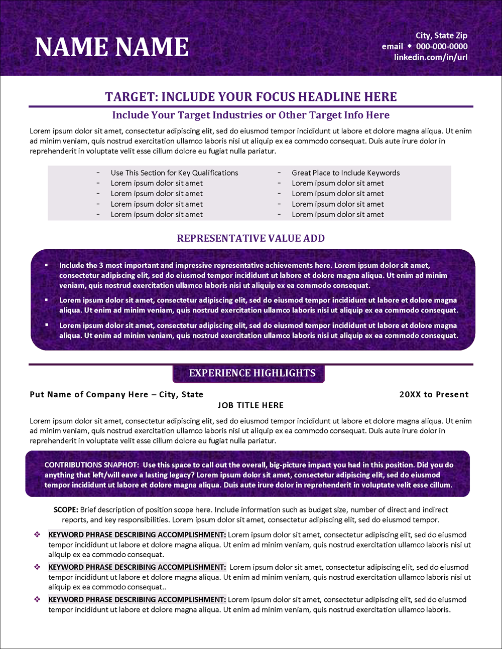
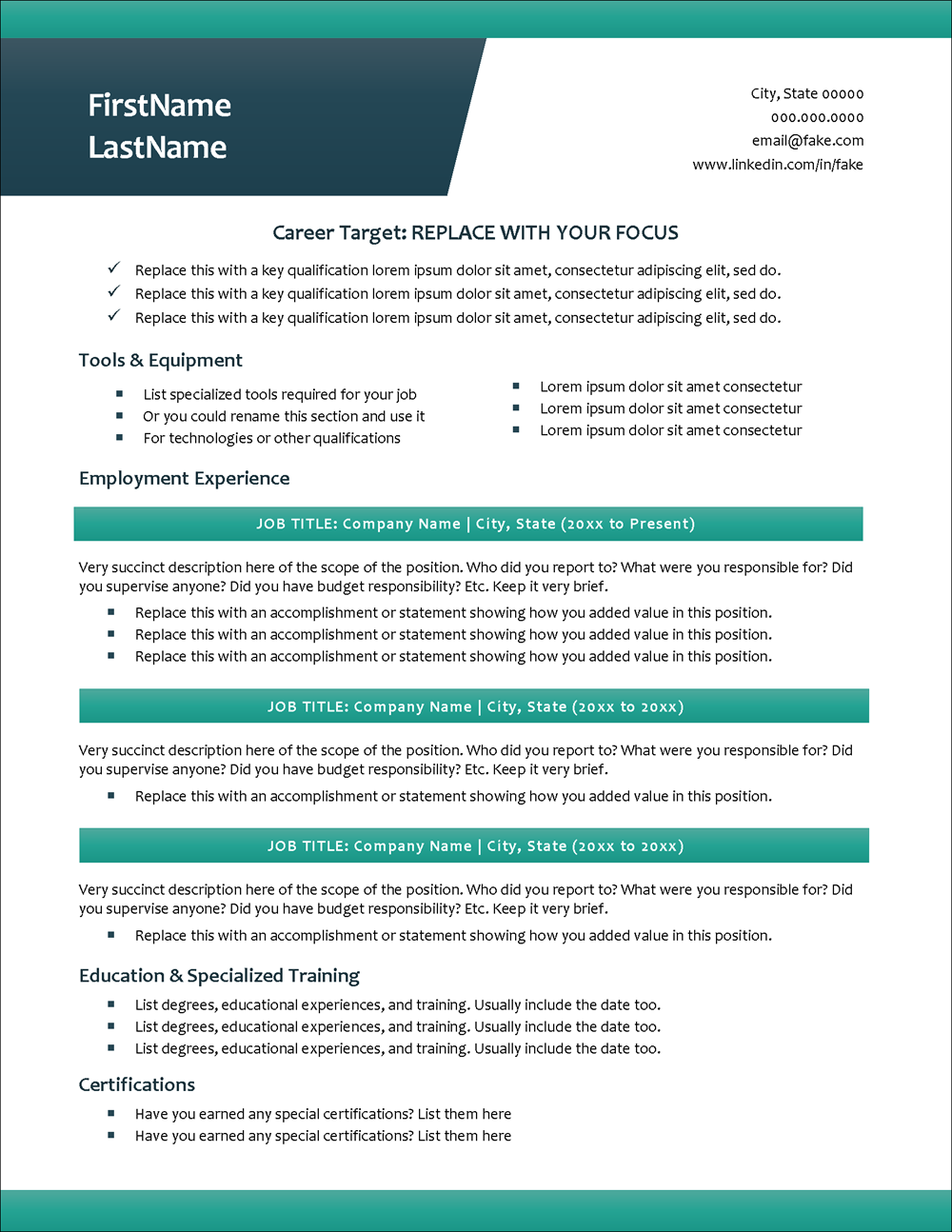
Serif Font on a Resume
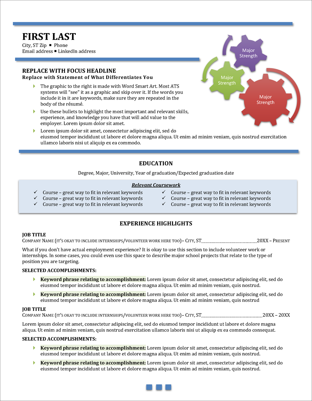
This student resume template from our Career Propellant Collection uses Cambria font, a serif font.
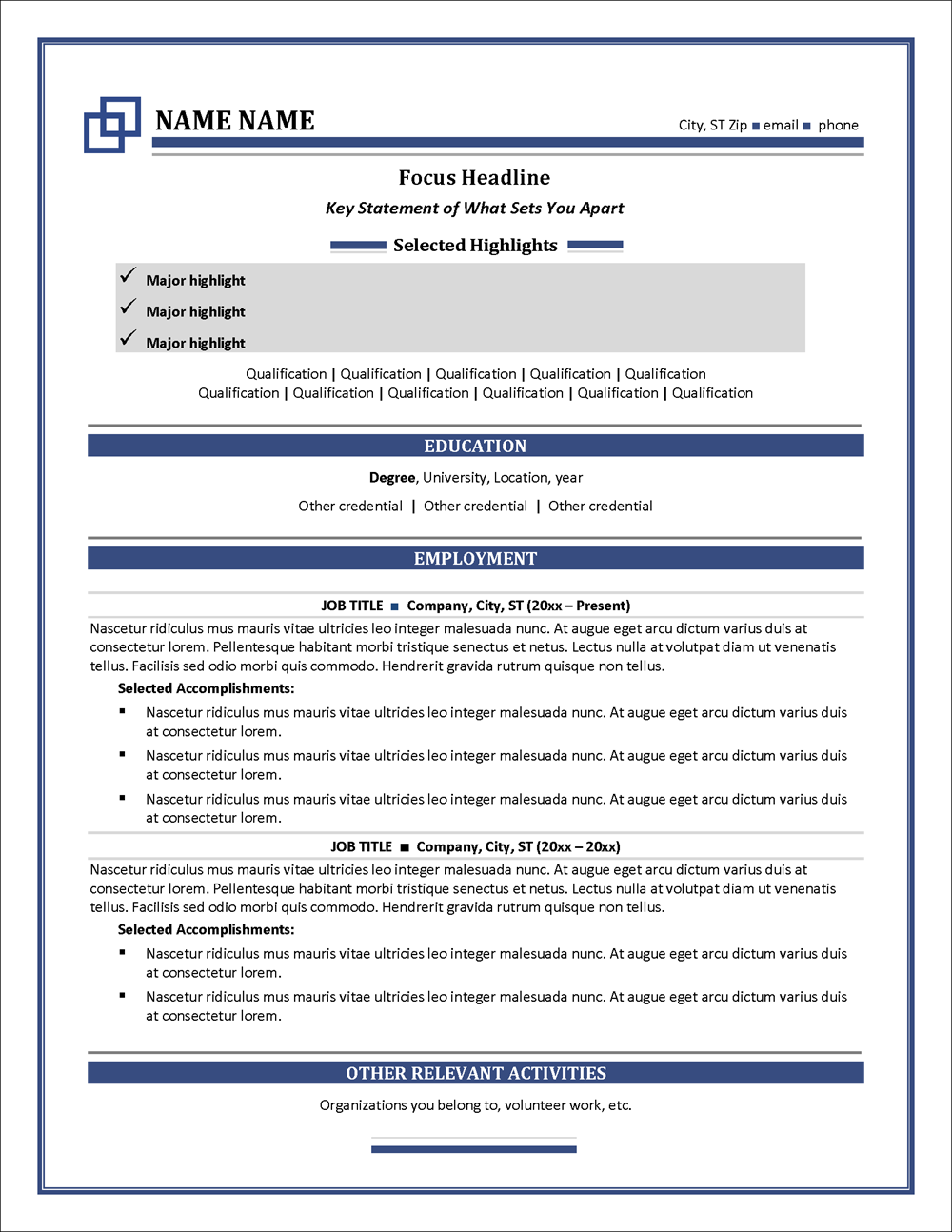
Sans-serif Font on a Resume
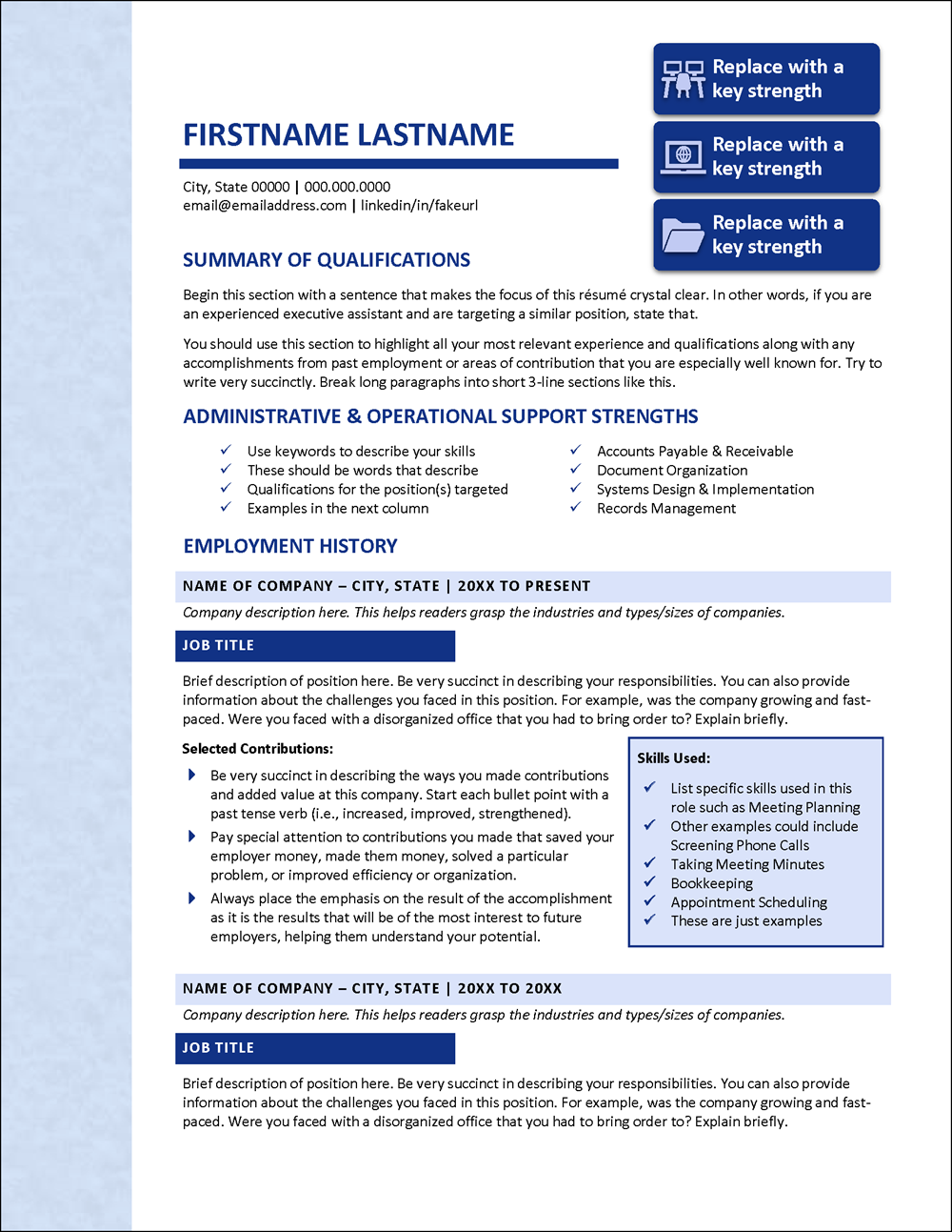
This administrative resume template from our Administrative Works Collection uses Calibri, a sans-serif font.
Your Resume Font Says a Lot About You
Have you ever noticed that some fonts ooze professionalism while others seem fun and lighthearted? Likewise, some fonts seem conservative, while others seem edgy and modern.
That’s because different fonts communicate different things. For example, sans-serif fonts are often seen as modern and sleek, while serif fonts are generally seen as more traditional. So if you’re applying for a job at a cutting-edge tech company, a sans-serif font is probably your best bet. On the other hand, if you’re trying to land a job in a more traditional field like law or medicine, a serif font might be your best choice.
We’ve applied these principles in our resume templates. Here are two examples:
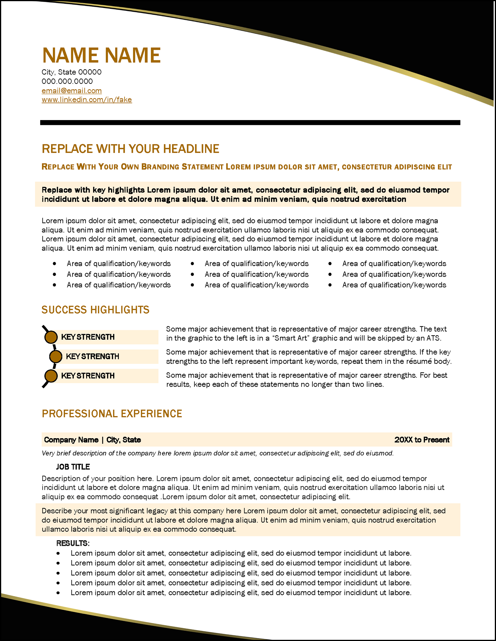
Resume Fonts for a Conservative Industry
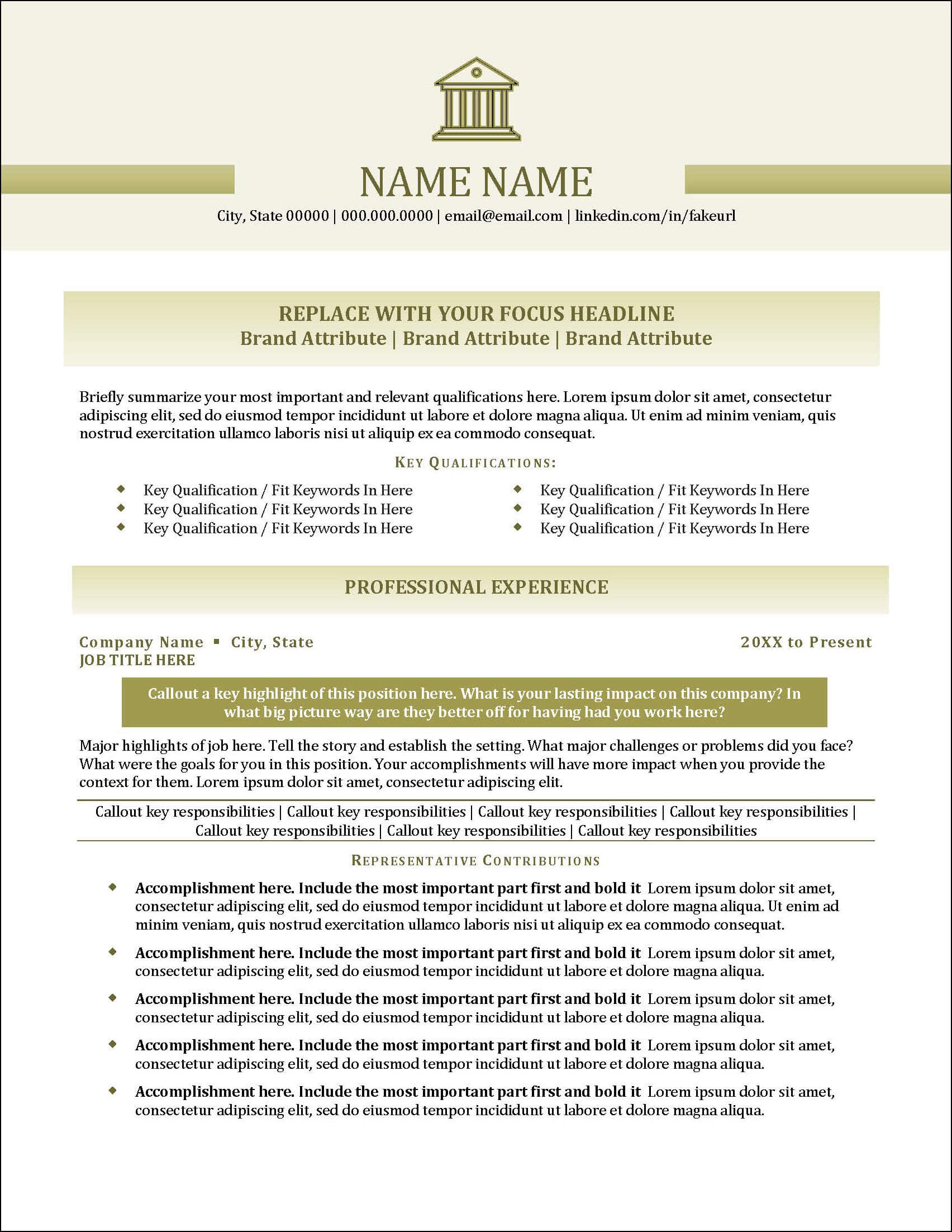
Banking is typically a conservative industry, and this banking resume template uses Cambria, a conservative serif font. This gives our Hire Advantage Banking Collection a traditional look and feel.
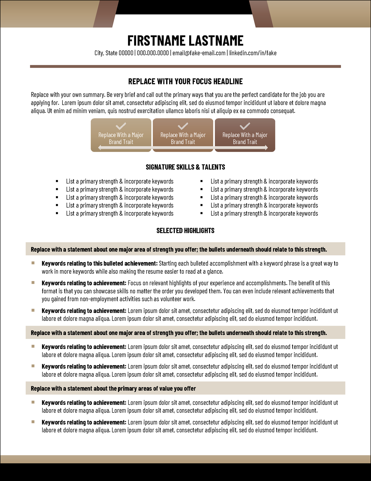
Resume Fonts for a Modern Industry
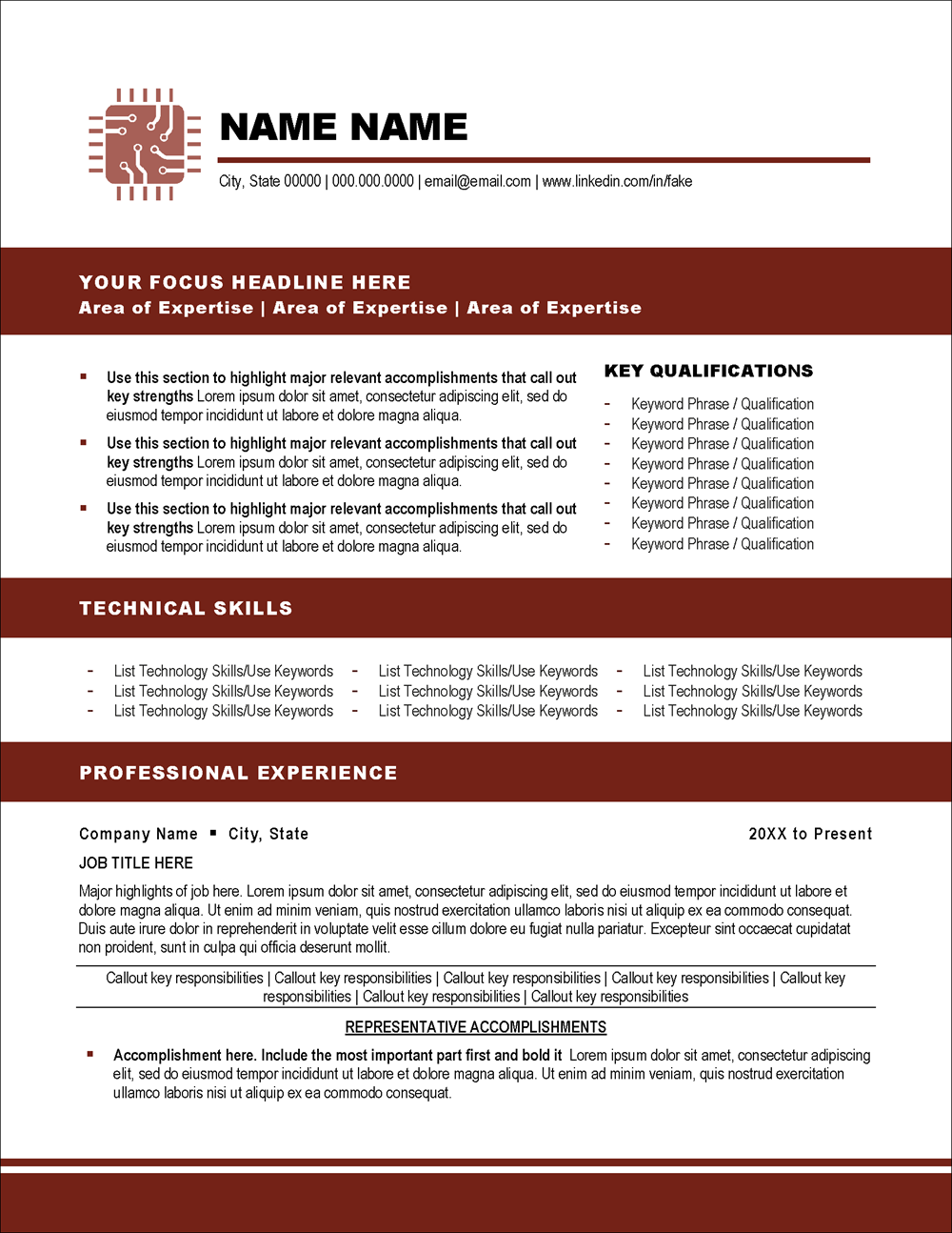
The IT resume template in the Technical Pursuits Collection uses two sans-serif fonts: Arial Black for headings and Arial Narrow for body text, giving it a modern, sleek look.
You want your audience to be engaged with your resume—not bored by it—and the right font can help with that. How? By adding visual interest and personality to your resume.
Not only does the font you use affect how people perceive you, but it also affects how they perceive your document as a whole. For example, using too many different fonts in one document can make it look disorganized and unprofessional. On the other hand, using two similar but slightly different fonts can make your document look more polished and put together. It’s all about finding the right balance!
We generally recommend no more than two fonts in a resume. Often, we will use one font for headings and another for body text, often choosing a serif font for the resume headings and a sans serif font for the body (or vice versa). Here are two more examples of this on resume templates.
Combining Two Fonts on One Resume
The combination of Cambria font for headings and Calibri for body font is an especially popular font and the traditionally formatted resume template in the Alluring Luxury Collection and one-page resume template in the Genesis Collection are examples that use this combination.
Some Fonts Work Better for ATS Than Others
Many employers and almost all recruiters use applicant tracking systems (ATS) to store resumes and track candidates through the hiring process. Therefore, your resume must be designed to be compatible with ATS so that it can be entered into the system without errors.
An enduring myth about ATS resumes is a holdover from a couple of decades ago when resume writers needed to worry about whether the resume was “scannable” so that it could be entered into the databases that were the precursor to modern ATS. These days, paper resumes are rarely, if ever, physically scanned into an ATS. Instead, they are entered digitally from the resume file you submit online or through email.
In the old days of scannable resumes, the font you chose was critical. If you chose the wrong one, the letters tended to “bleed together” in the scan, and the software could not read it. This is not that much of an issue in modern ATS, but you may still see outdated advice related to the scannable resumes of yesteryear.
Still, if you choose a really fancy or non-standard font—especially a serif one with lots of decorative lines—there are reports that it could cause problems when your resume is entered into an ATS.
Of course, if one of your primary concerns is the “readability” of the fonts on your resume, as suggested earlier in this post, you wouldn’t choose one of these problem fonts anyhow. If they aren’t readable to the ATS, they likely aren’t all that readable to a human reader either. But this gives you another reason to select simple, readable fonts for your resume.
More Guidelines for Choosing Resume Fonts
So with all of these factors in mind, what are the best fonts to choose for your resume design? Format retention across computer systems and readability should always be your top priorities—but don’t forget about engagement, image perception, and visual appeal.
What Fonts Do You Recommend for a Resume?
If you choose to use one of our resume templates, we’ve already selected fonts that work well together in a resume. But if you are creating a resume from scratch or wish to customize the fonts in our resume templates, you might try one of the following.
Sans Serif Fonts:
- Arial Narrow
- Barlow
- Calibri (one of our favorites for resumes)
- Century Gothic
- Corbel
- Candara
- Franklin Gothic Book
- Lucida Sans
- Tahoma
- Trebuchet
- Verdana
Serif Fonts:
- Baskerville Old Face
- Book Antiqua
- Cambria (this is another of our favorites for resumes)
- Century Schoolbook
- Garamond (though this is looking almost as dated as Times New Roman)
- Georgia
- Palatino
- Perpetua
- Source Serif Pro
All of the above fonts are default-installed fonts in Microsoft Word. However, some are better for body text and some are better for headings, so you should experiment to find the best combination for your resume.
But do keep in mind that just because a font is installed by default doesn’t mean it is a suitable font for a resume. Comic Sans, for example, would make a terrible font for most resumes. In general, avoid script fonts (the ones that look like cursive or handwriting) or anything you fear won’t make the first impression you want to make.

Here are more resume templates that make use of some of the recommended fonts above.
The skills-based resume template from the Core Skills Collection makes use of the sans-serif font Barlow.
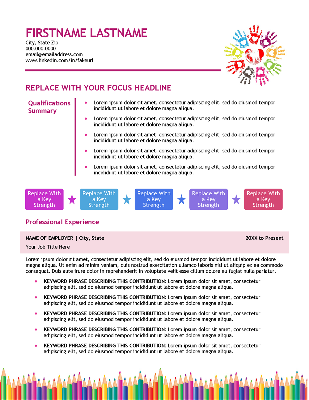
The quirky design of this early childhood education resume template from the Early Childhood Education Edge Collection uses the font Trebuchet.
The Tradecraft Collection includes a one-page resume template for tradespeople that makes use of the font Candara.
The uniquely designed resume template from our Trailblazer Collection uses the Franklin Gothic Book family of fonts.
What Is the Best Font Size for a Resume?
Some fonts are more compact than others so you will need to experiment a bit depending on the font you choose. However, as a general rule of thumb, 10-12 point font is usually the standard for resume body text.
Here is a tip: check to ensure you aren’t zoomed in or zoomed out as you work on editing your resume in Word. With a display setting of 100%, the text should be large enough to read easily.
Also, make sure to print your resume on paper. The text should be easy to read. The moment you make a hiring manager squint to read your resume, you’ve lost them. We use Calibri as the preferred font for many of our resume templates, with a minimum body text size of 10 points and a maximum of 11 points.
Your name at the top of your resume in the resume header should be formatted with the largest font size on your resume. It is common to use a font size anywhere from 18 pts to 28 pts.
The font size for the section headings of your resume will also often be slightly larger than the body text. For example, with 10 pt body text on our resume templates, we might size section headers anywhere from 12 to 14 pts.
What About Font Bolding, Italics & Other Formatting?
Let us dispel another common myth. Bolding or italicizing your resume font will have no impact on ATS compatibility. The same is true of using colors on fonts to highlight sections of your resume.
Used conservatively and strategically, bolding, italics, and colored fonts can positively impact your resume’s visual appeal and readability.
But too much of a good thing is not a good thing. These font formatting options should be used selectively to call the eye to key content in your resume. Too much of this makes your resume look messy, disorganized, and hard to read.
If you are having a tough time choosing the best resume fonts and figuring out how to format them, know that Distinctive Resume Templates are professionally designed with recommended fonts and formatting. When you use one of our MS Word resume templates, all the hard work is done for you.
If, instead, you decide to go it alone, follow the guidelines in this post and take some time to think about the fonts you will use in your resume. The right font can make all the difference in how professional and polished your resume looks—and in how people perceive you. So keep these tips in mind, and you’ll be sure to choose the best fonts every time!
Frequently Asked Questions
Why does the font choice matter when writing a resume?
Font choice for your resume matters because it affects readability, engagement, and visual appeal. Different fonts can portray different feelings – for instance, sans-serif fonts often appear modern and sleek, while serif fonts can seem more traditional. Your choice of font could potentially influence the recipient’s perception of your professionalism and the content of your resume.
What is the difference between default fonts, Cloud fonts, and custom fonts?
Default fonts are those that come pre-installed when you install Microsoft Word. Cloud fonts are a feature of newer versions of Word and can be automatically downloaded when the document is opened on another system with the same version of Word. Custom fonts are those that a user installs on their own, which are not included with Microsoft Word. When using custom or Cloud fonts, you risk the possibility of your resume not displaying correctly if the recipient does not have the same fonts installed.
What types of fonts are most readable for resumes?
There are two primary types of fonts: serif and sans serif. Serif fonts have small lines at the end of each stroke, while sans serif fonts do not. Both can be readable, depending on the specific font and its application. However, fonts with a moderate degree of contrast between the thickest and thinnest parts of each character are generally the most readable.
What considerations should I keep in mind when choosing a font for my resume?
You should consider readability, visual appeal, and how the font may come across to the recipient. Additionally, you should consider whether the font is installed by default in Microsoft Word to avoid any display issues when the recipient opens your resume. Lastly, you need to think about the font’s compatibility with applicant tracking systems (ATS) that many employers and recruiters use.
What font size should I use for my resume?
As a general rule, 10-12 point font is standard for the body text of a resume. However, this might vary depending on the specific font you choose, as some fonts are more compact than others. The font size for the header of your resume, including your name, can be larger – typically ranging from 18 to 28 points.
Can I use bolding, italics, and colored fonts in my resume?
Yes, bolding, italics, and colored fonts can be used to highlight key content in your resume. However, they should be used sparingly to maintain a clean, professional appearance. Excessive use of these elements can make your resume appear messy and hard to read.
What are some recommended fonts for a resume?
Recommended sans serif fonts include Arial Narrow, Barlow, Calibri, and Century Gothic among others. Serif font recommendations include Baskerville Old Face, Book Antiqua, Cambria, and Century Schoolbook. It’s advised to use no more than two fonts in a resume for a balanced, professional look.
How can I make sure my resume is compatible with applicant tracking systems (ATS)?
To ensure compatibility with ATS, avoid using non-standard or overly decorative fonts that could cause errors when your resume is entered into the system. Choose simple, readable fonts, and focus on the content of your resume, as this is what these systems will primarily analyze.